
|
 The Logo The Logo
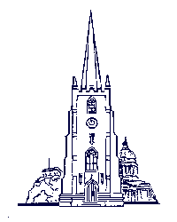
The current logo of St Peter's Church, Nottingham, was commissioned in 1980 by Malcolm
Goldsmith who was then the rector. At that
time the church was using a "trade mark" showing the Church, the Castle and the
Council House (which is still occasionally used today). But Malcolm felt the need for
something rather more modern and representational of what the church was trying to stand
for. He therefore commissioned Michael Gregory, an artist and printer of West Hallam,
Derbyshire, to produce the new logo in 1980.
|
 Malcolm explains the design as
follows - Malcolm explains the design as
follows -
- Central to it is a cross, but the cross is implicit rather than explicit - symbolising
an approach to mission which does not thrust the cross at people but allows them to see it
for themselves.
- There are many ways into the heart of the logo, suggesting that there are many ways into
the heart of the church. Some people may wish to move in and reach "the centre of
things", whilst others are quite prepared to move in, but stay more on the edges.
- All the routes in and out are open - anyone can come in and anyone can leave - there is
a freedom which allows people to take control of their own spiritual journeys, which does
not require them to pass over any boundary mark, and which allows them the freedom to move
away.
- It was also meant to symbolise the church being at the centre of the city.
Malcolm concludes "I was always very fond of the logo, and am pleased that it is
still used." It has certainly served us well over the years.
The logo is © St Peter's Church, Nottingham |
Return to the
General contents page
|